Coronavirus update: 9,000+ now infected in America, with NYC infections skyrocketing (because now they’re actually testing people)
03/18/2020 / By Mike Adams

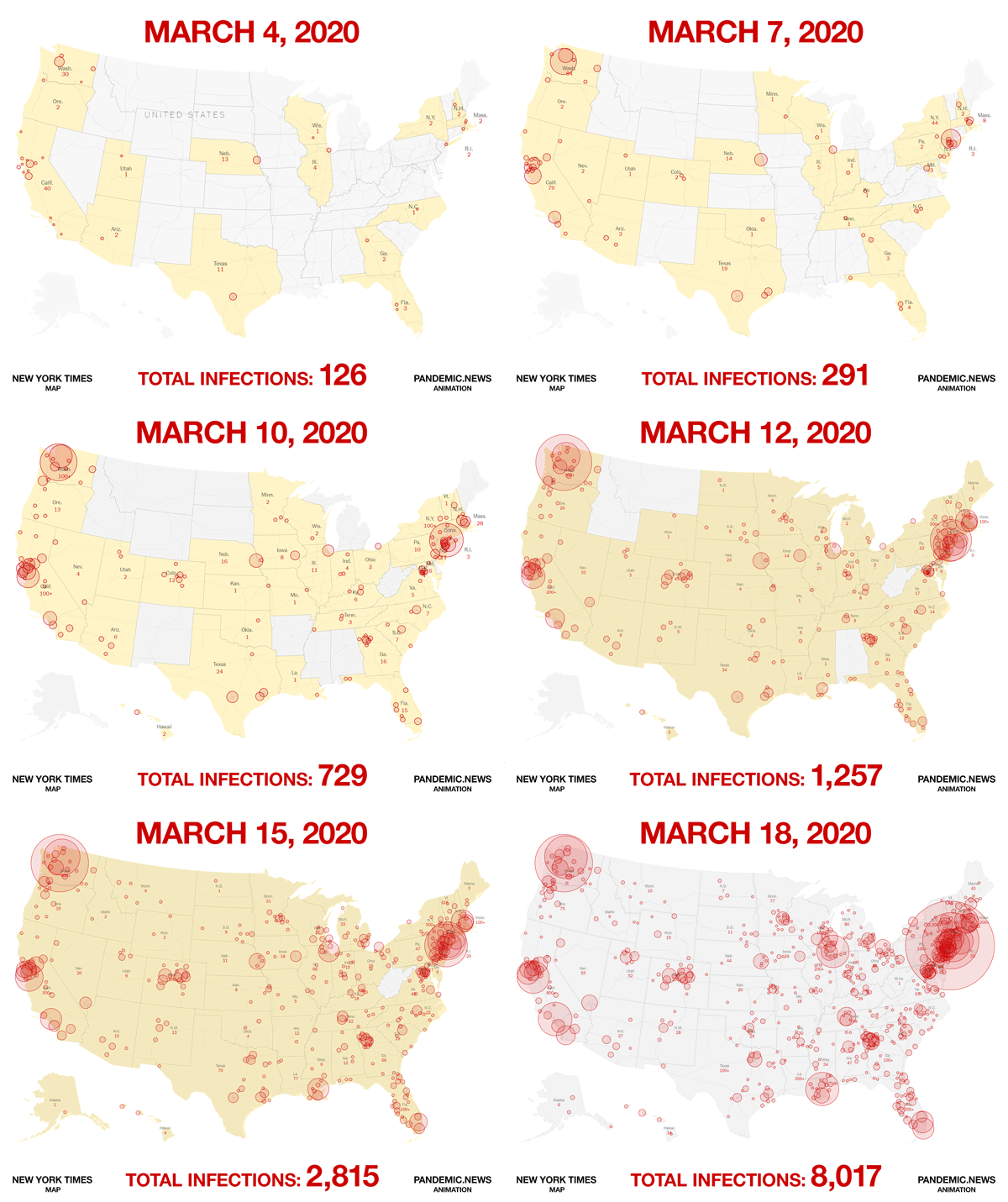
In less than one more day, the number of confirmed coronavirus infections in the USA will exceed 10,000. Already today, deaths in the USA have skyrocketed to 147. Confirmed infections are exploding in NYC and nearby cities, but that’s probably because NYC is actually conducting aggressive testing now. In many other cities, it remains very difficult to get tested for the coronavirus, even to this day (although hopefully that will change soon).
So the coronavirus is being found where the tests are being conducted, which almost certainly means the virus is geographically widespread, even if it hasn’t yet infected even one percent of the population. In other words, it has been very widely seeded across the landscape due to the high mobility of the population at large.
Our pandemic projection model (revision 2) currently places the number of calculated infections in the USA at 30,000. At this point, however, we can conclude our model was far too polite and most likely under-represents the number of real infections by a wide margin. It’s probably not unreasonable to suspect there might be 50,000 or more infections in the USA at this very moment. (We’ll explore even larger numbers below, as there are multiple possible scenarios to consider here.) But even that is far less than 1% of the total population.
Perhaps as many as 86% of those infected never show symptoms at all, even though they remain highly infectious to others. That fact, combined with the bizarre federal protocol that no one should be tested until they show symptoms, means that this virus will continue to spread exponentially for a long time yet to come, and we will have little or no knowledge of its spread since we aren’t testing asymptomatic carriers.
The pandemic explosion has only just begun in America, in other words. We’re not even 1% of the way through this yet:

Before I could get this story posted, by the way, the number jumped to 9,345 infections in the USA. So the map you see above is already obsolete.
Following the math: How 10,000 “confirmed” infections might mean 240,000 infected people walking around because of the detection time lag
What’s important to realize here is that by the time the number of confirmed infections in the USA reaches 10,000 (which will happen tomorrow), if we take the research that says 86% of those who are infected don’t even show symptoms (and thus are never tested), and we do really basic math without taking into account other time lag factors, we get this:
(simple math version) 10,000 confirmed infections = 60,000 asymptomatic carriers still walking around
Actually, the more accurate math shows a far worse situation, because by the time someone starts to show symptoms, they might be around six days into their infection, since it takes time to show symptoms. And in six days, the number of infected carriers has already doubled twice.
In other words, if you have, let’s say, 10,000 newly confirmed infections today, that means there were probably around 70,000 people infected in total around six days ago on average (that’s 10,000 people who later show symptoms, and 60,000 people who never show symptoms). While the 10,000 symptomatic people are now tested and confirmed, the other 60,000 people spread it to 120,000 in three days, and then those 120,000 spread it to 240,000 in another three days or so (because it doubles about every 3 days on average, according to current trends).
Which means that by the time you have 10,000 confirmed infected, you actually might have 240,000 infected people who were never tested.
We are right now at around 10,000 confirmed infections in the USA, by the way.
Of course, after a period of time, all those asymptomatic carriers become self-immunized and non-contagious, so the math begins to get quite complex. That’s why I’ve modeled all this in a downloadable spreadsheet so that you can see the time lags, the exponential math, the removal of “no longer infectious” people from the pool of the actively infected, and so on.
This pandemic can’t be explained with super simple math, it turns out. You need a complex model that takes into account all these things. And that’s why my model has been tracking the daily deaths very closely (although too optimistically, which means I’ve been overly optimistic in the numbers, to the surprise of many people who thought I was publishing “doom and gloom”).
Here’s what my original model predicted (version 1) would happen: Projected vs. Actual
| Date | Projected Deaths | Actual Deaths |
| 6-Mar | 13 | 17 |
| 7-Mar | 15 | 19 |
| 8-Mar | 18 | 22 |
| 9-Mar | 22 | 23 |
| 10-Mar | 26 | 30 |
| 11-Mar | 30 | 32 |
| 12-Mar | 35 | 41 |
| 13-Mar | 40 | 50 |
| 14-Mar | 47 | 54 |
| 15-Mar | 54 | 60 |
| 16-Mar | 62 | 79 |
| 17-Mar | 71 | 100 |
| 18-Mar | 81 | 147 |
This model, by the way, takes us to 421 deaths by April 1st, then 7,929 deaths by May 1st. However, that model did not yet incorporate strong social distancing factors such as the lockdowns and social isolation measures that have since been put into place, so we hope to see the actual deaths start to “flatten” in a few more weeks, meaning the rate of increase would begin to slow.
The chart above is from our pandemic projection model revision 1. Our newer revision 2 model predicts a total of 160 deaths by tomorrow. Here’s the projected USA deaths for the next 10 days:
160.2
180.2
202.7
228.1
256.6
288.7
324.7
365.3
411.0
462.4
By April 1st, under this model, we should see 712 deaths in the USA, followed by over 10,000 deaths by the time we hit May.
Regardless of which model we use, if we don’t flatten the curve, we end up with literally millions of deaths by July, just in the USA alone. Most people still can’t mentally grasp that, as they aren’t ready to accept it. That’s why they make up stories about this being some sort of global “hoax” — because they’re not psychologically ready to deal with the horrifying reality that millions of people will die if we don’t change our ways.
Fortunately, we have already begun to change our ways through social distancing, isolation, quarantines, etc. Those work. They break the cycle of exponential spread.
In about 30 – 45 days, those who called this a hoax will look incredibly foolish for clinging to their narrative. Once thousands start dying each week in the United States, it’s going to be increasingly difficult to pretend it’s all some sort of staged false flag theater of some kind.
We’ll keep you posted at Pandemic.news, where math and science determines our message, not politics or ignorance.
Tagged Under: chaos, Collapse, coronavirus, deaths, fatalities, infections, outbreka, pandemic, projections, SHTF
RECENT NEWS & ARTICLES
COPYRIGHT © 2017 DISASTER NEWS


